


Slim Secrets
How do you rebrand a range of better-for-you low sugar snacks? By letting you in on our little secret.
What we did
- Art Direction
- Brand Strapline & Story
- Branding Identity
- Campaign Language
- Packaging
- Photography


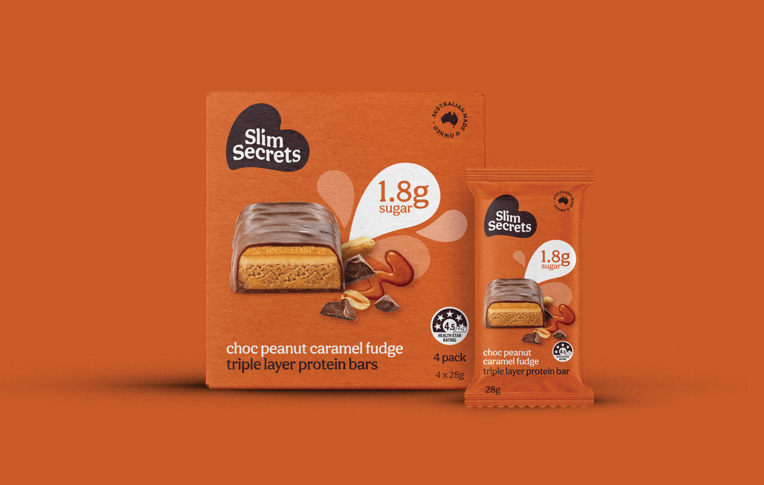
Who said less sugar had to mean less fun. Slim Secrets have created a range of delicious treats that have less sugar but don’t compromise on a well-deserved moment of indulgence. In redesigning the Slim Secrets brand, it was important to take the focus away from body image and diet culture and reposition it as a fun and playful brand that champions healthier choices and a balanced lifestyle.


The logo we designed features a heart which references self-care and looking after yourself with the customers at the ‘heart’ of everything that Slim Secrets stand for. We created a language that builds on the ‘less is more’ mentality and a focus on what you will gain from the range of these delectable treats. In redesigning the packaging, we wanted to give the products a much more indulgent feel. We did this through simple, yet bright colours and delicious ingredients abundant on the pack.
