

Cobs Popcorn
How do you take a popping brand to a broader market? By growing with them, you know the right time to rebrand.
What we did
- Art Direction
- Brand Guidelines
- Brand Story
- Branding Identity
- Campaign Language
- Digital Marketing
- Packaging
- Photography
- Print Design
- Publication Design
- Social Media
- Strapline
- Videography
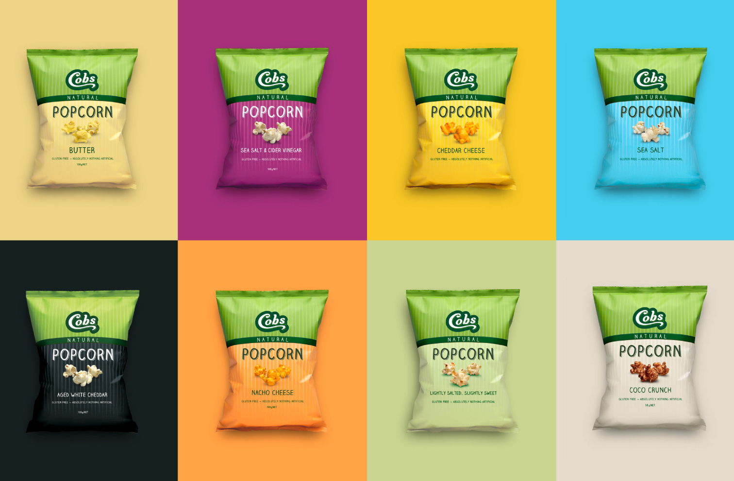


Cobs Popcorn needed to put their tasty popcorn on the map. So we created a comprehensive branding and packaging system, compelling communication strategy and campaignable idea that’s been successfully used across all types of marketing and advertising. With a modern 3D logo, retro styling and the use of strong colour, Cobs flavour variants now stand out on shelves all across Australia.


