
Riverina Fresh
How do you refresh a century of dairy heritage? With a fresh perspective.
What we did
- Packaging
- Brand Story
- Strapline
- Campaign Language
- Brand Strategy & Positioning
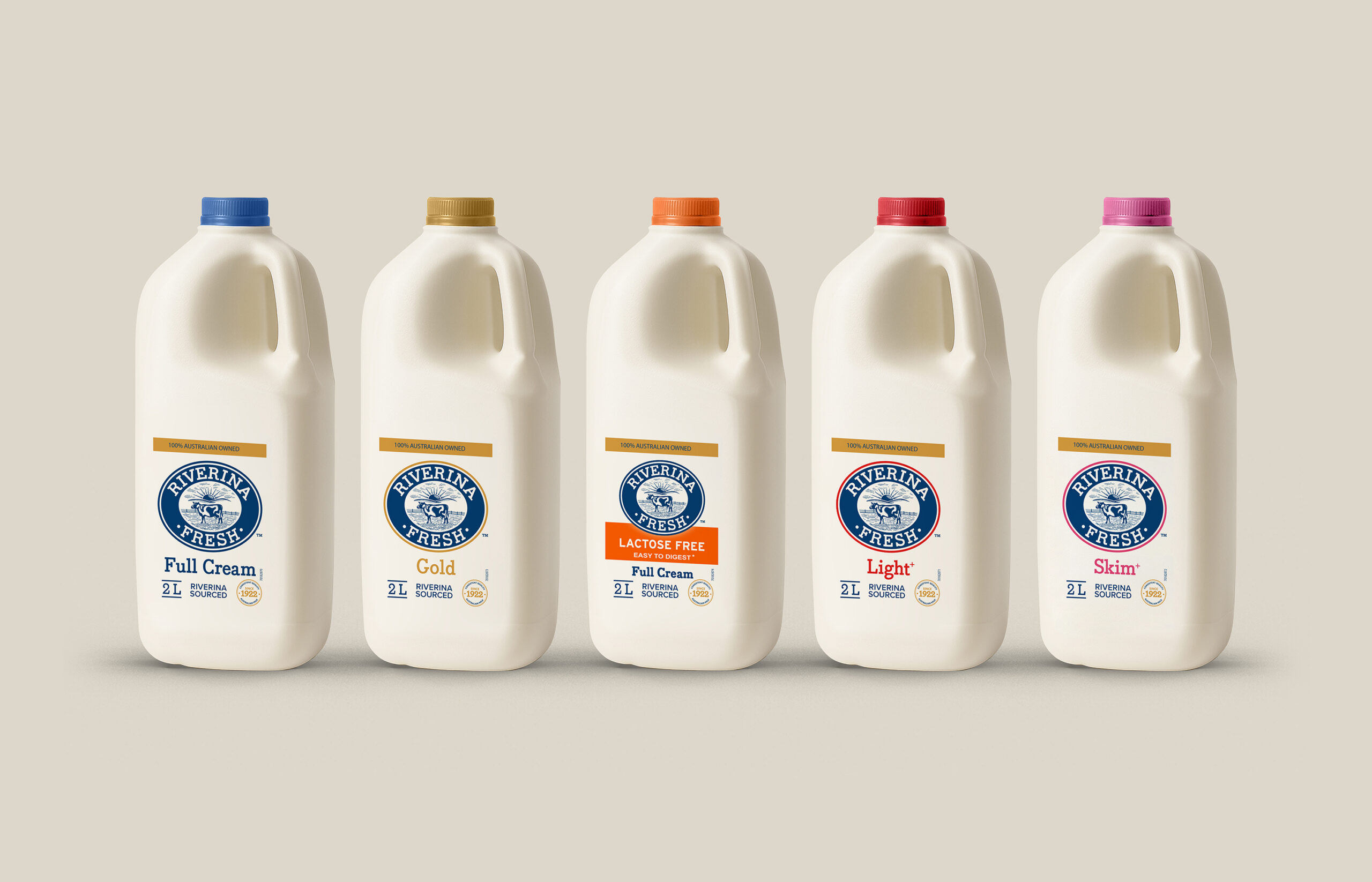
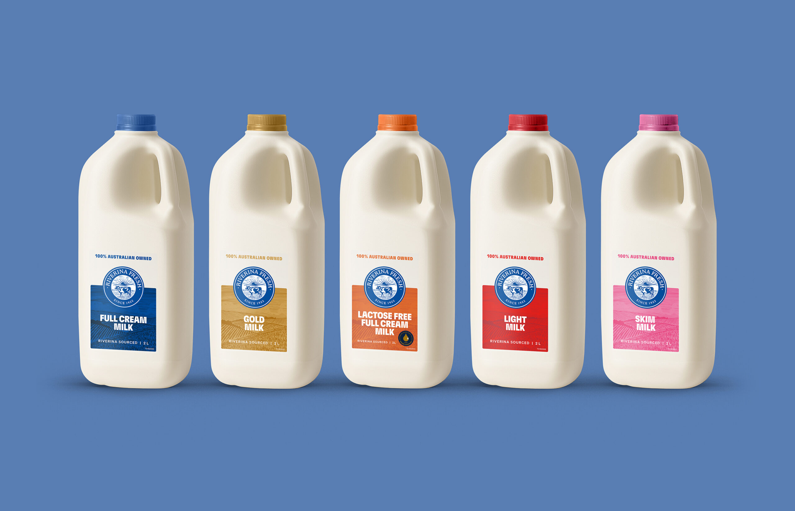
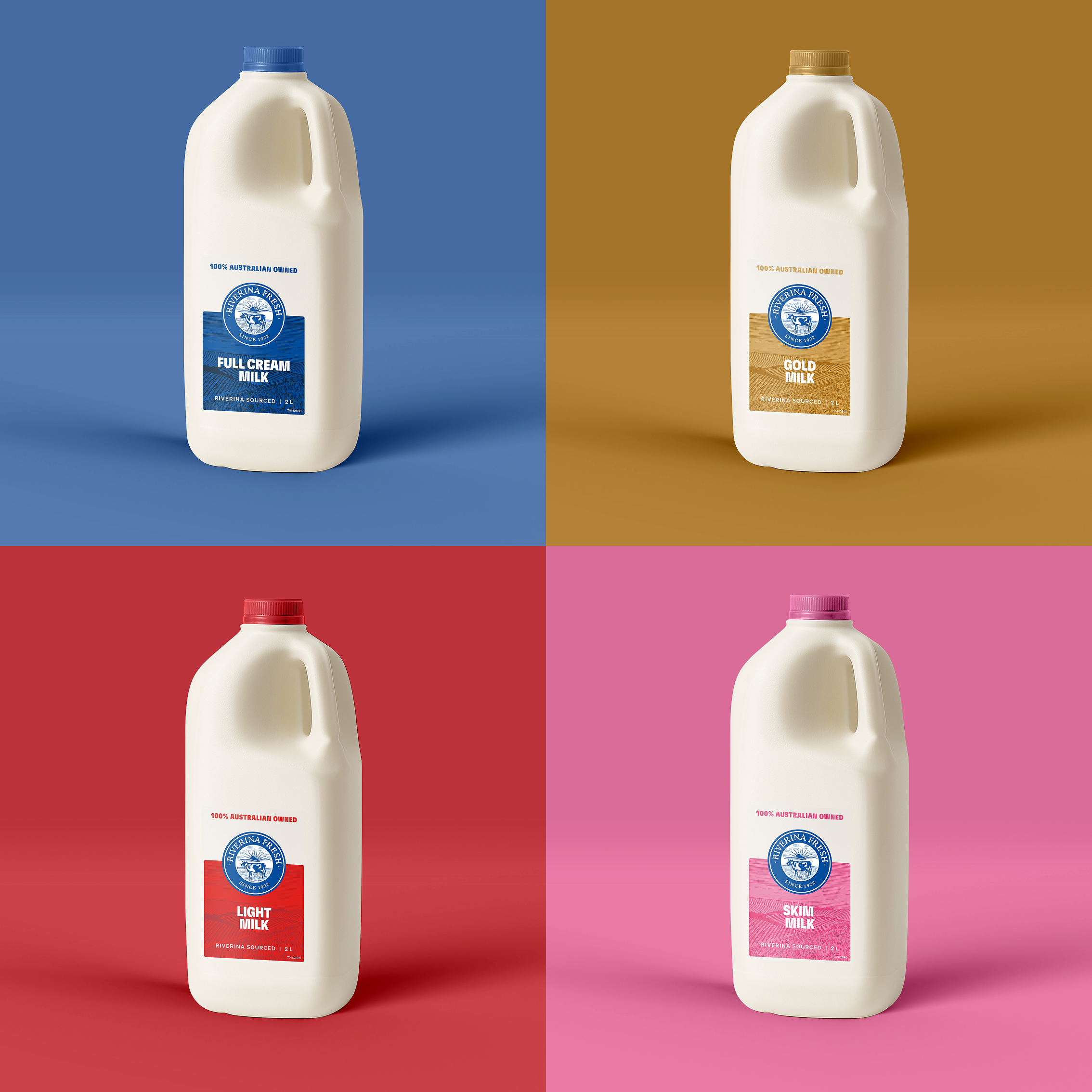
We set out to give Riverina Fresh’s milk range a stronger shelf presence, creating packaging that balances a familiar Australian dairy identity with a fresh, distinctive look.
With roots in Wagga Wagga dating back to 1922, Riverina Fresh has built its reputation on great-tasting dairy, local partnerships and an unwavering commitment to quality. The challenge was to evolve its packaging while building on the legacy that has made it a trusted name in Australian dairy.
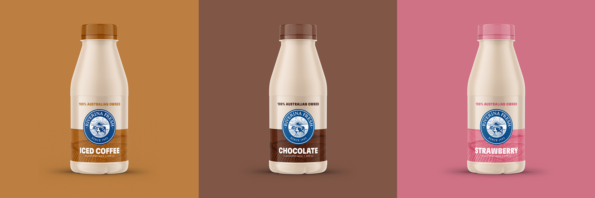
We developed a refreshed packaging system that brings the Riverina Fresh identity to the forefront, balancing a clean, contemporary look with a strong connection to its regional roots. A distinctive colour palette gives each milk variety its own personality, while confident typography, clear product naming and a consistent layout create a cohesive family across the range.
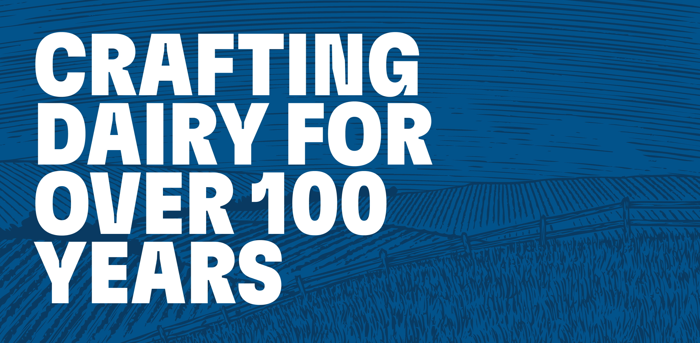
Subtle textures inspired by the land add depth and character, reinforcing the brand’s connection to the Riverina region. Every detail works to communicate freshness and quality, while making it easy for shoppers to find their preferred product.
The result is a refreshed range that feels distinctly Riverina Fresh. A considered evolution that honours more than a century of dairy-making heritage while giving the brand a stronger, more contemporary presence on shelf.